
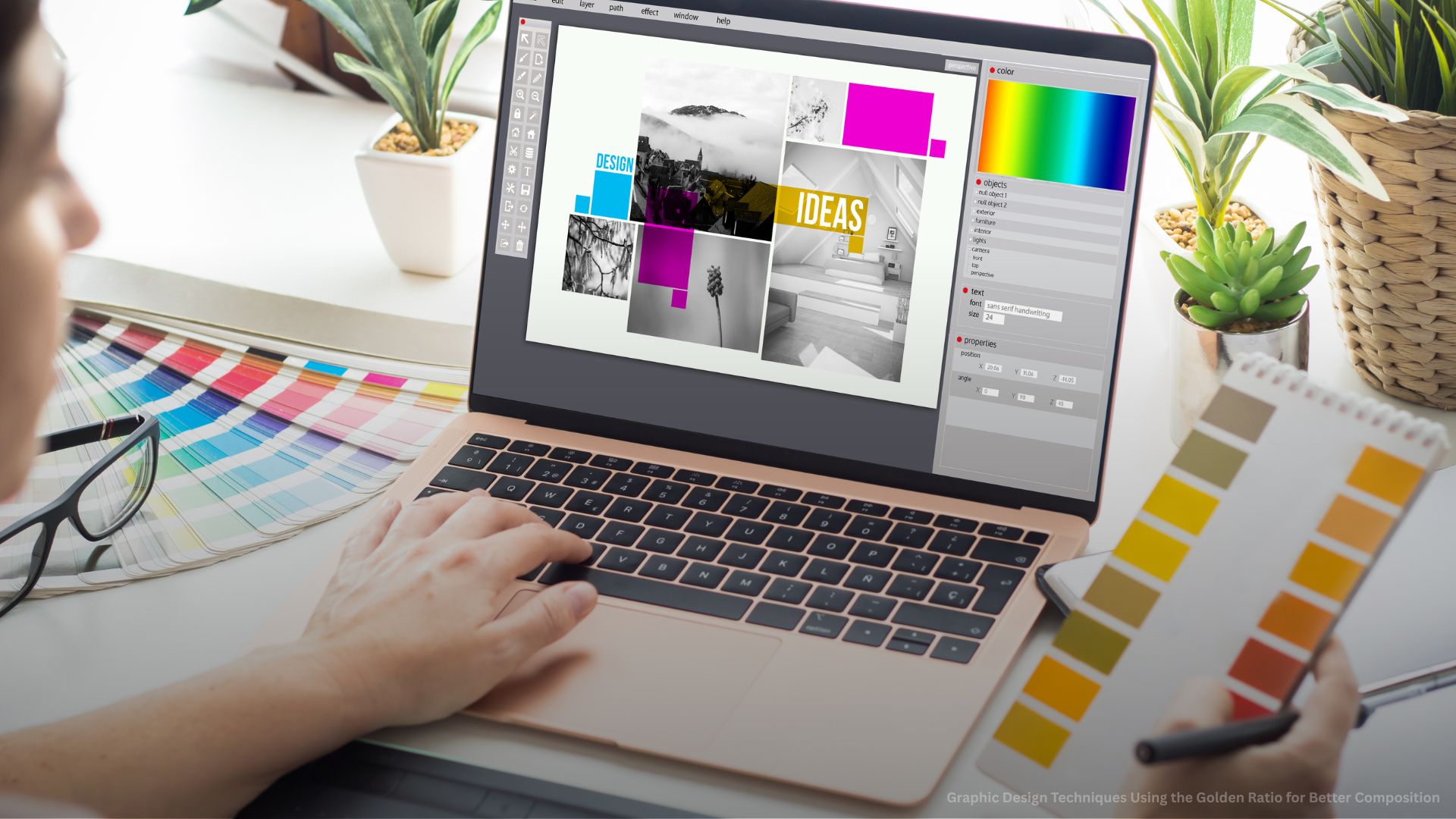
Strong visual design relies on structure, proportion, and intentional spacing. One of the most reliable methods used by professional designers is the Golden Ratio Graphic Design approach. This principle helps create layouts that feel naturally balanced and visually appealing without forcing symmetry or rigid alignment. The golden ratio has been used in art, architecture, and modern digital design because it reflects proportions found in nature, which the human eye tends to find comfortable and attractive. When applied properly, it improves clarity, hierarchy, and overall composition across branding, web design, and UI/UX projects.
Understanding the Golden Ratio in Design
The golden ratio, approximately 1.618, is a mathematical proportion that appears consistently in nature, architecture, and classical art. In golden ratio in design, this proportion is used as a guiding framework for spacing, sizing, and layout structure. Instead of relying on guesswork or personal preference, designers apply this ratio to create visuals that feel naturally balanced and visually comfortable to the viewer. It helps establish order within a composition, reduces visual chaos, and improves the way users process and interact with design elements. Because the human eye tends to respond positively to natural proportions, the golden ratio often results in designs that feel more refined, professional, and aesthetically pleasing.
Key Concepts of the Golden Ratio
- Natural visual balance: Creates compositions that feel instinctively pleasing and aligned with how the human eye perceives proportion and symmetry
- Mathematical structure: Uses a fixed proportional system that removes randomness and ensures consistency across design elements
- Organic flow: Guides the viewer’s eye naturally through the layout, creating a smooth visual journey across content
- Universal application: Can be applied in digital interfaces, branding systems, print layouts, motion graphics, and packaging design
- Proportional hierarchy: Helps define clear levels of importance between headings, images, and supporting elements
- Reduced design guesswork: Replaces subjective spacing decisions with structured and repeatable design logic
- Timeless aesthetic appeal: Has been used in classical art and modern design, making it a long-standing principle of visual harmony
- Scalable system: Works effectively across small interface components, full-page layouts, and large-format designs
- Improved readability: Enhances text spacing and layout clarity, making content easier to scan and understand
- Consistent visual rhythm: Creates predictable spacing patterns that improve overall composition flow
Understanding these principles strengthens design principles for better layout and helps designers create more structured, intentional, and visually balanced compositions that communicate messages more effectively.
Golden Ratio Grid System for Layout Design
The golden ratio grid system is a structured layout method that divides a composition into proportional sections based on the 1:1.618 ratio. This system provides designers with a clear framework for organizing visual elements such as text, images, and interactive components. Instead of placing elements arbitrarily, the grid ensures that every part of the design follows a logical structure that supports balance and readability. It helps maintain consistency across different screen sizes and improves how users navigate and interpret visual content.
Golden Ratio Grid Techniques
- Fibonacci spiral layout: Apply spiral-based guides to naturally position focal points where the viewer’s attention is most likely to land
- Proportional section division: Divide layouts into larger and smaller sections using golden ratio measurements for natural balance
- Focal point alignment: Position key visuals or messages along grid intersections to enhance focus and visibility
- Whitespace balance: Use proportion-based spacing to prevent clutter and improve content breathing room
- Image composition control: Align images with grid intersections or spiral curves to create a stronger visual impact and storytelling
- Content zoning: Separate headers, body text, and visuals into clearly defined sections for better readability
- Responsive grid adaptation: Maintain proportional structure across desktop, tablet, and mobile devices without losing balance
- Margin and padding consistency: Apply ratio-based spacing rules to create clean and structured layouts
- Layer hierarchy planning: Organize background, midground, and foreground elements using proportional depth control
- Alignment consistency: Ensure all elements follow grid-based alignment for a more polished and professional appearance
- Visual flow control: Guide user attention from one section to another in a structured and intentional sequence
This system significantly improves design composition by providing a repeatable and scalable structure for creating visually balanced, professional-quality layouts across different design platforms and use cases.
Improving Design Composition with Golden Ratio Techniques
Composition is one of the most important foundations of strong visual design. It determines how elements are arranged, how attention flows, and how clearly a message is communicated. The golden ratio improves composition by introducing a structured system for spacing, hierarchy, and visual rhythm. Instead of relying only on intuition or trial and error, designers can use this proportional framework to create layouts that feel more intentional, balanced, and professional. It ensures that every visual element has a defined place and purpose, reducing randomness and improving clarity across the entire design.
Composition Improvement Strategies
- Balanced element spacing: Use golden ratio-based spacing between text, images, and UI components to create consistent visual breathing room
- Focal hierarchy creation: Guide user attention by controlling the size, placement, and contrast of key elements within the layout
- Proportional scaling system: Adjust all design elements using consistent ratio-based relationships to maintain harmony across the composition
- Structured alignment: Align all components using grid and proportional guidelines to maintain order and visual stability
- Visual rhythm creation: Build a predictable flow between elements that naturally leads the viewer through the content step by step
- Negative space control: Use whitespace strategically to improve readability, reduce clutter, and highlight important content
- Consistency across layouts: Apply the same proportional rules across multiple pages, screens, or design variations for a unified look
- Emphasis through proportion: Highlight important elements by increasing size contrast or adjusting placement within the composition
- Design clarity enhancement: Remove unnecessary visual noise and structure content to improve communication and readability
- Content grouping: Organize related elements together using proportional spacing to improve structure and understanding
- Flow direction control: Guide the viewer’s eye movement intentionally from one section to another using visual hierarchy
- Visual weight balancing: Distribute elements evenly so no part of the design feels too heavy or too empty
These techniques strengthen graphic design composition techniques and help create more refined, structured, and professional visual outputs that communicate messages more effectively.
Typography and Golden Ratio in Visual Design
Typography is one of the most influential elements in visual balance in graphic design, and the golden ratio provides a structured system for improving how text is sized, spaced, and arranged. Proper typographic proportion ensures that content remains readable while still maintaining aesthetic harmony across different sections of a design. Without structure, typography can easily feel inconsistent or visually disconnected. By applying golden ratio principles, designers can create a clear hierarchy between headings, subheadings, and body text, resulting in a more organized and visually appealing reading experience.
Typography Techniques Using the Golden Ratio
- Font size hierarchy: Use proportional scaling between headings, subheadings, and body text to create a clear visual structure
- Line height optimization: Adjust line spacing using proportional rules to improve readability and reduce visual strain
- Letter spacing adjustments: Fine-tune spacing between characters to improve clarity and maintain typographic balance
- Typographic rhythm: Create consistent vertical spacing between text blocks for smoother reading flow
- Visual hierarchy structuring: Clearly separate primary messages, secondary information, and supporting text elements
- Font pairing balance: Combine different typefaces that work harmoniously within a proportional system
- Responsive text scaling: Maintain readability and consistency across desktop, tablet, and mobile devices
- Grid-aligned typography: Position text blocks according to layout grids and proportional spacing rules
- Emphasis control: Highlight key messages using size, weight, or spacing variations based on hierarchy needs
- Content readability improvement: Ensure text remains easy to scan and understand through consistent spacing rules
- Text block proportioning: Control the width and height of text areas using golden ratio relationships
- Hierarchy reinforcement: Strengthen information structure so users can quickly identify important content
These practices improve typography and golden ratio implementation across both digital and print design systems, resulting in cleaner, more structured, and visually harmonious typography layouts.
Golden Ratio in Logo and UI/UX Design
The golden ratio is widely used in branding and digital interface design because it creates structure, balance, and visual consistency across different design elements. In logo design, it helps produce shapes and proportions that feel naturally aligned and memorable, making brand marks more recognizable and timeless. In UI/UX design, it improves usability by guiding how elements are arranged, spaced, and prioritized on a screen. When applied correctly, it supports smoother navigation, clearer hierarchy, and more intuitive user interactions. These principles ensure that users do not just see a design, but also understand it quickly and comfortably.
Design Applications in Branding and UI/UX
- Logo construction grids: Build logos using circles, spirals, and geometric forms based on golden ratio proportions for balanced composition
- Icon design consistency: Maintain proportional harmony across all icons to ensure a unified visual language
- UI layout structuring: Organize interface sections using ratio-based grids for clearer separation of content
- Button and element sizing: Design interactive elements using proportional scaling to improve usability and visual balance
- Navigation placement: Position menus and navigation elements in predictable, structured areas to improve user experience
- Visual hierarchy in interfaces: Guide attention using size, spacing, and contrast to highlight important actions and content
- Spacing consistency in UI: Maintain uniform margins and padding across all interface elements for a clean and organized look
- Responsive interface scaling: Preserve proportional relationships across desktop, tablet, and mobile screens
- Brand identity consistency: Apply golden ratio principles across logos, UI elements, and marketing visuals for cohesive branding
- Interactive element balance: Ensure buttons, cards, and inputs feel evenly distributed within layouts
- User flow optimization: Structure layouts to naturally guide users from one action to the next
- Content prioritization: Use proportion to highlight primary actions and reduce visual confusion
These techniques are essential for UI/UX design composition rules and help create digital experiences that feel intuitive, visually balanced, and easy to navigate.

Rule of Thirds vs Golden Ratio in Design
Both the rule of thirds and the golden ratio are widely used aesthetic design principles, but they differ significantly in structure, precision, and application. The rule of thirds divides a layout into equal horizontal and vertical sections, making it simple and fast to apply, especially for beginners. The golden ratio, on the other hand, uses mathematical proportions to create more natural, fluid, and visually refined compositions. It is often preferred in advanced design work where precision, harmony, and visual sophistication are required. Understanding both systems allows designers to choose the most effective approach based on project goals and complexity.
Comparison Between Design Principles
- Rule of thirds simplicity: Easy to apply and useful for quick composition decisions, especially in basic layouts and photography
- Golden ratio precision: Provides a more refined and mathematically balanced structure for professional design work
- Flexibility level: The golden ratio allows more organic, fluid, and natural-looking compositions compared to rigid grid divisions
- Use in branding: The golden ratio is commonly used in premium and luxury branding for its sophisticated visual appeal
- Use in photography: The rule of thirds is widely used for framing subjects quickly and effectively
- Depth of composition: Golden ratio creates more layered, structured, and visually rich layouts
- Design control: Golden ratio offers more structured guidance for spacing, hierarchy, and proportion
- Creative freedom: Rule of thirds allows faster placement decisions with less structural restriction
- Visual sophistication: The golden ratio produces more elegant and timeless design outcomes
- Learning curve: Rule of thirds is easier for beginners, while the golden ratio requires more understanding of proportion systems
- Application range: The golden ratio is more versatile across branding, UI/UX, and advanced digital design systems
Both systems improve at creating balanced graphic layouts, depending on the level of precision, design intent, and visual complexity required for a project.
Designing with Precision and Natural Balance
Applying the Golden Ratio Graphic Design approach helps designers create compositions that feel structured, balanced, and visually appealing. It brings clarity to layout decisions, improves typography, and enhances overall design harmony. Whether used in branding, UI/UX, or digital graphics, the golden ratio provides a reliable system for building professional and aesthetically strong visuals. When combined with other design principles, it elevates both creativity and functionality, resulting in more effective and engaging design work.
Elevate Your Design Quality with Hourglass Marketing Solutions
Hourglass Marketing Solutions delivers professional design services built on strong visual principles like the golden ratio. Our team creates visually balanced branding, UI/UX layouts, and digital graphics that improve engagement and strengthen brand identity. Contact us today to transform your creative ideas into structured, high-quality, and visually compelling designs that stand out in competitive markets.